

We chat with Amnesia’s Music Director on Ibiza’s most iconic logos

As another Ibiza season gets into full swing, we caught up with good friend, music mover & shaker and Gareth’s 90s clubbing wingman… Neil Evans during his pit stop in Dubai and explore our favourite Ibiza logos and branding.
Firstly, an introduction to Neil. He’s Music & Events Director of Ibiza’s largest nightclub… Amnesia, he runs his promotion and management company Electric Ibiza, along with the Do Not Sleep and Epic Pool Parties in Miami amongst others. And he’s also recently been featured in MixMag, Forbes and now the Acid Works blog. So he’s keeping busy.
Both Neil and Gareth met around 1997 in the North East of England and quickly became friends thanks to their mutual interest in all things clubland, music and design. (Cemented by many a bus ride to clubs like The Bomb (Nottingham), Sugar Shack (Middlesborough), Shindig (Newcastle) and of course ‘the afters’. They also have an entrepreneurial spirit and being ‘only childs’ in common, not that you’d ever tell of course…


Looking back… we never really knew what we were doing, or what lay ahead. We just wanted to enjoy ourselves and do stuff around dance music. Be it our own club nights, designing flyers or releasing records.
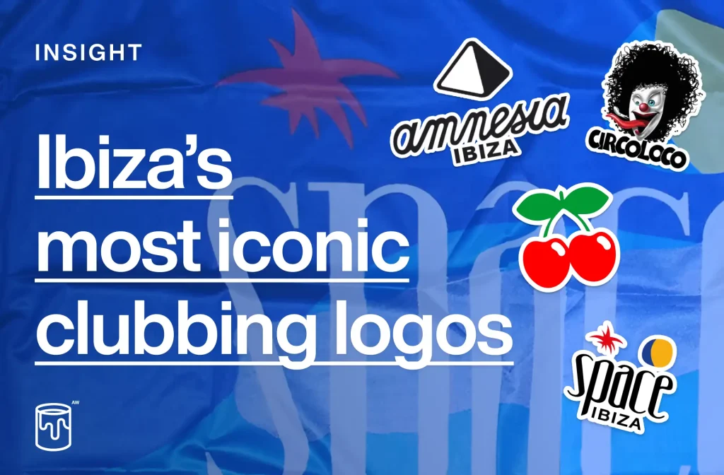
So with him back in the Middle East on business, we had a chance to catch up, reminisce, gossip (standard) and put the seeds of this article together. So without further ado, we present to you our ‘Top 5 / most influential Ibiza logos of all time’ with some thoughts from both of us below on what makes them so special. Enjoy.
1/5
Amnesia
Let’s kick off with an obvious one… Amnesia has stood the test of time, being one of few remaining names on the island still around today. Also being Neil’s current home… it’s only right to include it at the top of our list. Today, Amnesia continues to be a powerhouse on the island, it boasts the largest capacity of the clubs and by nature the biggest parties. Let’s look take a look at it’s logo…
![]()
Neil – Of course Amnesia means a lot to me as it’s where I work and have been going since I was 18 years old. But yes indeed, there’s a power and a mystery about it, perhaps it’s the scale of the venue, it’s slightly intimidating, ominous but ultimately a place of happiness and togetherness for clubbers across the decades.
Gareth – What I find most charming about Amnesia is it’s mostly unchanged type. It’s still just as memorable today as it’s always been and looks equally as mysterious as it does local, traditional and wonderfully Spanish.


2/5
Pacha
Pacha, widely regarded as ‘the world’s most famous nightclub’ and perhaps one of the world’s most famous logos. Its red cherry logo is a beacon of quality around the world, a brand and lifestyle phenomenon.
Gareth – As a designer, for me Pacha’s cherries are amongst the most recognisable icons in logo history. As a teenager, perhapsNintendo and Pacha springs to mind when I think of logos I loved. It’s just a beautifully simple yet iconic silouhette with the red and green working perfectly. Thinking back, what’s equally impressive is the business behind the logo, it’s been on point with merch and its global scale for as long as I can remember. Clubs aside, the brand has grown globally as a happening taste maker, that’s as much of a lifestyle brand as it is a night life one.
Neil – Like Gareth said there can be no doubt how much Pacha has became a globally recognised symbol of partying and glamour. Like everything things have a tendency to move on and change. The Dubai based Five recently acquiring Pacha being a good example of that. But let’s hope the spirit of the red cherries stands the test of time.

Pacha’s merchandise has always been ahead of the pack for sheet collectability, its logo having a feminine, glamorous charm that just as collectable as a key ring as it is a t-shirt. They have now grown to entire clothing collections and collabs, with dedicated stores on the island and even at the airport.

3/5
Space
In the late 90s / early 00s Space was the widely regarded as the pinnacle of global clubbing. With its famous all day Sunday parties being the must do event for holidays makers on the island. The bright colours of the logo was a symbol of the summer which adorned thousands of t-shirts, flags and other merch that would be acquired by discerning revellers. Neil – For me, Space was at it’s absolute peak around the same time was here working all summer around 1999 – 2003. It’s difficult to compare the total dominance the club had at that time. Both from a music and crowd point of view. It was the one place you could not miss.
Gareth – The Space flags were almost like the Brazil strip of clubland. Bright colours, palm trees and sun shapes. The words ‘Ibiza Dance’ confidently and simply supporting the logo. It was like a rally cry for summer.


4/5
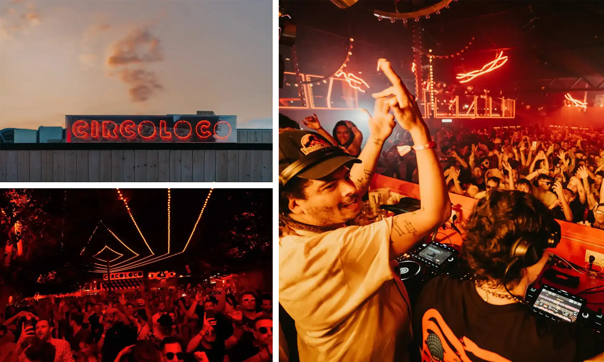
Circo Loco
Conveniently following Space in our list… Circo Loco was born in 1999, opening it’s doors to those still looking to party on a Monday morning. The small farmhouse at the end of the airport runway in Ibiza has become one of the best known clubbing destinations on the planet. ‘Crazy Circus’ has gone onto become a global phenomenon, perhaps the biggest name in clubbing today.
![]()
Neil – The clown logo was a sign of chaos, rebellion and had an underdog mindset which I always loved. Who’d have known it would have gone onto become what it has today, a huge well done to all of the promoters and owners over the years.
Gareth – What’s interesting about Circo Loco and DC10 is it how much it’s succeeded whilst still having the same DNA and vibe as when it first started. I was there in 2022 and you could feel it in the air. The attitude and vibe has been perfectly bottled and scaled, Off White did a collab with them when I was there in 2022 and DJs like Benji B were wearing the shirts.
![]()
Check out this detailed video that goes deep into the history of Circo Loco, it’s far from perfect (and riddled with AI generated video)… but it’s an end-to-end story about the club with the best footage you can find.
5/5
Ku
And for our final choice we take it all the way back to 1978. Later known as Privelidge and home to the infamous Manumission, Ku was one of the icons of the island in the 80s. Vibrant colour and illustration were the hallmarks of Ku’s promotional material. Which still stand the test of time.

Share this article
